• Steven Ponce
  • About
  • Data Visualizations
  • Projects
  • Resume
  • Email

On this page

  • Challenge
  • Visualization
  • Steps to Create this Graphic
    • 1. Load Packages & Setup
    • 2. Read in the Data
    • 3. Examine the Data
    • 4. Tidy Data
    • 5. Visualization Parameters
    • 6. Plot
    • 7. Save
    • 8. Session Info
    • 9. GitHub Repository
    • 10. References
    • 11. Custom Functions Documentation

Chronic burdens climbed as infectious diseases fell

  • Show All Code
  • Hide All Code

  • View Source

Among 25 causes that ranked among WHO’s leading causes of global disease burden in 2000 or 2021, diabetes rose from 18th to 7th, while HIV/AIDS fell from 7th to 21st and measles from 11th to 25th. COVID-19 disrupted the order in 2020-21.

SWDchallenge
Data Visualization
R Programming
2026
A bump chart ranks the leading global causes of disease burden from 2000 to 2021, showing chronic conditions like diabetes climbing as infectious diseases like HIV/AIDS and measles declined. COVID-19 abruptly disrupted the two-decade reordering, jumping to the top rank by 2021. Built in R with ggplot2 and ggbump using WHO Global Health Estimates data.
Author

Steven Ponce

Published

September 1, 2026

Challenge

Categories can be tricky to visualize over time when the underlying numbers don’t align: different scales, different totals, different counts year over year. This month’s challenge is to share a bump chart that sets that noise aside and shows what actually moved.

Additional information can be found HERE

Visualization

Figure 1: Bump chart ranking 25 leading causes of global disease burden (DALYs), WHO data 2000–2021. Diabetes mellitus climbed from 18th to 7th and back and neck pain from 13th to 6th, while HIV/AIDS fell from 7th to 21st and measles from 11th to 25th — a two-decade shift from infectious to chronic burden. COVID-19 disrupted the pattern abruptly, jumping from 25th in 2019 to 1st by 2021. Diarrhoeal diseases held steady near 9th. Twenty other tracked causes appear as unlabeled gray reference lines. Source: WHO Global Health Estimates 2021.

Steps to Create this Graphic

1. Load Packages & Setup

Show code
```{r}
#| label: load

if (!require("pacman")) install.packages("pacman")
pacman::p_load(
  tidyverse, ggtext, showtext, janitor, scales, glue, ggview, ggbump
  )

# Source utility functions
suppressMessages(source(here::here("R/utils/fonts.R")))
source(here::here("R/utils/social_icons.R"))
source(here::here("R/utils/image_utils.R"))
source(here::here("R/themes/base_theme.R"))
```

2. Read in the Data

Show code
```{r}
#| label: read

# The workbook was tidied separately in `WHO_GHE_DALY_tidy.R`.
# https://github.com/poncest/SWDchallenge/blob/main/2026/09_Sep/WHO_GHE_DALY_tidy.R

df_tidy <- read_csv(
  here::here("data/SWDchallenge/2026/who_ghe_daly_global_tidy.csv"),
  show_col_types = FALSE
) |>
  clean_names()
```

3. Examine the Data

Show code
```{r}
#| label: examine
#| include: true
#| eval: true
#| results: 'hide'
#| warning: false

glimpse(df_tidy)
skimr::skim_without_charts(df_tidy)
```

4. Tidy Data

Show code
```{r}
#| label: tidy
#| output: false

endpoint_causes <- c(
  "Lower respiratory infections", "Diarrhoeal diseases",
  "Preterm birth complications", "Ischaemic heart disease", "Stroke",
  "Tuberculosis", "HIV/AIDS", "Birth asphyxia and birth trauma", "Malaria",
  "Road injury", "Measles", "Chronic obstructive pulmonary disease",
  "Back and neck pain", "Congenital anomalies", "Other neonatal conditions",
  "Cirrhosis of the liver", "Self-harm", "Diabetes mellitus",
  "Depressive disorders", "Interpersonal violence", "COVID-19",
  "Trachea, bronchus, lung cancers", "Other hearing loss", "Falls",
  "Kidney diseases"
)

year_lookup <- tibble(year = c(2000, 2010, 2015, 2019, 2020, 2021), year_index = 1:6)
# x-axis uses year_index (equal categorical spacing), not true year value.
# True temporal spacing was tested and reverted: it made
# COVID's rise correctly abrupt but crowded the 2019-2021 endpoint label
# Caption disclose the six periods are unevenly spaced in reality.

highlight_causes <- tribble(
  ~cause,                 ~story_group,
  "Diabetes mellitus",   "Rising chronic burden",
  "Back and neck pain",  "Rising chronic burden",
  "HIV/AIDS",            "Declining infectious burden",
  "Measles",             "Declining infectious burden",
  "Diarrhoeal diseases", "Declining infectious burden",
  "COVID-19",            "Pandemic disruption"
)

df_bump <- df_tidy |>
  filter(cause %in% endpoint_causes) |>
  group_by(year) |>
  mutate(rank = min_rank(desc(dalys))) |>
  ungroup() |>
  left_join(year_lookup, by = "year") |>
  left_join(highlight_causes, by = "cause") |>
  mutate(
    story_group = factor(
      story_group,
      levels = c("Rising chronic burden", "Declining infectious burden", "Pandemic disruption")
    )
  ) |>
  arrange(cause, year)

df_background <- df_bump |> filter(is.na(story_group))
df_highlight  <- df_bump |> filter(!is.na(story_group))
df_labels <- df_highlight |> filter(year == 2021) |> mutate(label = glue("{cause}  ({rank})"))
```

5. Visualization Parameters

Show code
```{r}
#| label: params

### |-  plot aesthetics ----
clrs <- get_theme_colors(
  palette = list(
    rising     = "#722F37", 
    declining  = "#7A8B92", 
    disruption = "#5C5954", 
    background = "#C7C2B8",
    accent     = "#722F37", 
    neutral    = "#9B968C"  
  )
)

story_colors <- c(
  "Rising chronic burden" = clrs$palette[["rising"]],
  "Declining infectious burden" = clrs$palette[["declining"]],
  "Pandemic disruption" = clrs$palette[["disruption"]]
)

### |- titles and caption ----
title_text <- "Chronic burdens climbed as infectious diseases fell"

subtitle_text <- glue(
  "Among 25 causes that ranked among WHO's leading causes of global disease burden ",
  "in 2000 or 2021, <span style='color:{story_colors[[\"Rising chronic burden\"]]}'><b>diabetes rose from 18th to 7th</b></span>, ",
  "while <span style='color:{story_colors[[\"Declining infectious burden\"]]}'><b>HIV/AIDS fell from 7th to 21st</b></span> ",
  "and measles from 11th to 25th. COVID-19 disrupted the order in 2020-21."
)

caption_text <- paste0(
  create_swd_caption(
    year = 2026,
    month = "Sep",
    source_text = "WHO Global Health Estimates 2021"
  ),
  "<br>DALY = one year of healthy life lost. Ranks are among 25 causes appearing in WHO's top 20 in 2000 or 2021.",
  "<br>Years are unevenly spaced (2000-2021) but plotted at equal intervals."
)

### |- fonts ----
setup_fonts()
fonts <- get_font_families()

### |- plot theme ----
base_theme <- create_base_theme(clrs)

weekly_theme <- extend_weekly_theme(
  base_theme,
  theme(
    axis.title = element_blank(),
    axis.text.x = element_text(family = fonts$text, size = 9, color = "grey35"),
    axis.text.y = element_text(family = fonts$text, size = 8, color = "grey55"),
    axis.ticks = element_blank(),
    panel.grid.major.x = element_blank(),
    panel.grid.major.y = element_line(color = "grey91", linewidth = 0.35),
    panel.grid.minor = element_blank(),
    legend.position = "none",
    plot.title = element_text(
      family = fonts$title_1, face = "bold", size = 22, margin = margin(b = 8)
      ),
    plot.subtitle = element_textbox_simple(
      family = fonts$subtitle, size = 11, margin = margin(t = 4, b = 20), 
      lineheight = 1.25
    ),
    plot.caption = element_markdown(
      family = fonts$caption, size = 7, color = "grey40", hjust = 0, 
      margin = margin(t = 20, b = 0),  lineheight = 1.15
      ),
    plot.margin = margin(t = 24, r = 130, b = 24, l = 36)
  )
)

theme_set(weekly_theme)
```

6. Plot

Show code
```{r}
#| label: plot
#| output: false

### |-  plot ----
p <- ggplot(df_bump, aes(x = year_index, y = rank, group = cause)) +
  geom_bump(
    data = df_background,
    color = clrs$palette[["neutral"]],
    alpha = 0.45,
    linewidth = 0.2,
    smooth = 7
  ) +
  geom_bump(
    data = df_highlight,
    aes(color = story_group, linewidth = story_group),
    smooth = 7
  ) +
  geom_point(
    data = df_highlight,
    aes(color = story_group),
    size = 2.4
  ) +
  geom_text(
    data = df_labels,
    aes(x = 6.12, label = label, color = story_group),
    hjust = 0,
    size = 3.15,
    family = fonts$text,
    fontface = "bold"
  ) +
  scale_color_manual(values = story_colors, guide = "none") +
  scale_linewidth_manual(
    values = c(
      "Rising chronic burden" = 1.35,
      "Declining infectious burden" = 1.2,
      "Pandemic disruption" = 1.05
    ),
    guide = "none"
  ) +
  scale_x_continuous(
    breaks = year_lookup$year_index,
    labels = year_lookup$year,
    limits = c(0.72, 6.25),
    expand = expansion(mult = 0)
  ) +
  scale_y_reverse(
    breaks = c(1, 5, 10, 15, 20, 25),
    limits = c(25.5, 0.5),
    expand = expansion(mult = 0)
  ) +
  coord_cartesian(clip = "off") +
  labs(title = title_text, subtitle = subtitle_text, caption = caption_text)
```

7. Save

Show code
```{r}
#| label: save
#| warning: false

### |- save ----
main_path  <- here::here("data_visualizations", "SWD Challenge", "2026", "swd_2026_09.png")
thumb_path <- here::here("data_visualizations", "SWD Challenge", "2026", "thumbnails", "swd_2026_09.png")

# Full-size version, for the QMD figure
save_ggplot(
  plot = p,
  file = main_path,
  width = 10,
  height = 8,
  units = "in",
  dpi = 300,
  create.dir = TRUE
)

# Reduced-size thumbnail, for the YAML `image:` field
fs::dir_create(dirname(thumb_path))
magick::image_read(main_path) |>
  magick::image_resize("400") |>
  magick::image_write(thumb_path)
```

8. Session Info

TipExpand for Session Info
R version 4.6.1 (2026-06-24)
Platform: aarch64-apple-darwin23
Running under: macOS Tahoe 26.6.2

Matrix products: default
BLAS:   /Library/Frameworks/R.framework/Versions/4.6/Resources/lib/libRblas.0.dylib 
LAPACK: /Library/Frameworks/R.framework/Versions/4.6/Resources/lib/libRlapack.dylib;  LAPACK version 3.12.1

locale:
[1] en_US.UTF-8/en_US.UTF-8/en_US.UTF-8/C/en_US.UTF-8/en_US.UTF-8

time zone: America/New_York
tzcode source: internal

attached base packages:
[1] stats     graphics  grDevices utils     datasets  methods   base     

other attached packages:
 [1] here_1.0.2      ggbump_0.1.0    ggview_0.2.2    glue_1.8.1     
 [5] scales_1.4.0    janitor_2.2.1   showtext_0.9-8  showtextdb_3.0 
 [9] sysfonts_0.8.9  ggtext_0.1.2    lubridate_1.9.5 forcats_1.0.1  
[13] stringr_1.6.0   dplyr_1.2.1     purrr_1.2.2     readr_2.2.0    
[17] tidyr_1.3.2     tibble_3.3.1    ggplot2_4.0.3   tidyverse_2.0.0
[21] pacman_0.5.1   

loaded via a namespace (and not attached):
 [1] gtable_0.3.6       xfun_0.60          htmlwidgets_1.6.4  tzdb_0.5.0        
 [5] vctrs_0.7.3        tools_4.6.1        generics_0.1.4     curl_7.1.0        
 [9] parallel_4.6.1     pkgconfig_2.0.3    RColorBrewer_1.1-3 skimr_2.2.2       
[13] S7_0.2.2           lifecycle_1.0.5    compiler_4.6.1     farver_2.1.2      
[17] textshaping_1.0.5  repr_1.1.7         codetools_0.2-20   snakecase_0.11.1  
[21] litedown_0.10      htmltools_0.5.9    yaml_2.3.12        pillar_1.11.1     
[25] crayon_1.5.3       magick_2.9.1       commonmark_2.0.0   tidyselect_1.2.1  
[29] digest_0.6.39      stringi_1.8.7      rprojroot_2.1.1    fastmap_1.2.0     
[33] grid_4.6.1         cli_3.6.6          magrittr_2.0.5     base64enc_0.1-6   
[37] withr_3.0.3        bit64_4.8.2        timechange_0.4.0   rmarkdown_2.31    
[41] bit_4.6.0          otel_0.2.0         ragg_1.5.2         hms_1.1.4         
[45] evaluate_1.0.5     knitr_1.51         markdown_2.0       rlang_1.3.0       
[49] gridtext_0.1.6     Rcpp_1.1.2         xml2_1.6.0         rstudioapi_0.19.0 
[53] vroom_1.7.1        jsonlite_2.0.0     R6_2.6.1           fs_2.1.0          
[57] systemfonts_1.3.2 

9. GitHub Repository

TipExpand for GitHub Repo

The complete code for this analysis is available in swd_2026_09.qmd. For the full repository, click here.

10. References

TipExpand for References

SWD Challenge: - Storytelling with Data: September 2026 — bump it!

Data Sources: - World Health Organization. Global Health Estimates 2021: Disease burden by cause, age, sex, by country and by region, 2000–2021. December 2020. https://www.who.int/data/gho/data/themes/mortality-and-global-health-estimates/global-health-estimates-leading-causes-of-dalys — global DALYs by cause, 2000, 2010, 2015, 2019, 2020, 2021. WHO’s Top20 worksheet reports the 20 leading causes in 2000 and 2021; their union forms the 25-cause comparison set ranked in this chart.

Data Preparation: - Tidying script: WHO_GHE_DALY_tidy.R — converts the WHO workbook into long/tidy format prior to the ranking and visualization steps in the main script.

11. Custom Functions Documentation

Note📦 Custom Helper Functions

This analysis uses custom functions from my personal module library for efficiency and consistency across projects.

Functions Used:

  • fonts.R: setup_fonts(), get_font_families() - Font management with showtext
  • social_icons.R: create_social_caption() - Generates formatted social media captions
  • image_utils.R: save_plot() - Consistent plot saving with naming conventions
  • base_theme.R: create_base_theme(), extend_weekly_theme(), get_theme_colors() - Custom ggplot2 themes

Why custom functions?
These utilities standardize theming, fonts, and output across all my data visualizations. The core analysis (data tidying and visualization logic) uses only standard tidyverse packages.

Source Code:
View all custom functions → GitHub: R/utils

Back to top

Citation

BibTeX citation:
@online{ponce2026,
  author = {Ponce, Steven},
  title = {Chronic Burdens Climbed as Infectious Diseases Fell},
  date = {2026-09-01},
  url = {https://stevenponce.netlify.app/data_visualizations/SWD%20Challenge/2026/swd_2026_09.html},
  langid = {en}
}
For attribution, please cite this work as:
Ponce, Steven. 2026. “Chronic Burdens Climbed as Infectious Diseases Fell.” September 1. https://stevenponce.netlify.app/data_visualizations/SWD%20Challenge/2026/swd_2026_09.html.
Source Code
---
title: "Chronic burdens climbed as infectious diseases fell"
subtitle: "Among 25 causes that ranked among WHO's leading causes of global disease burden in 2000 or 2021, diabetes rose from 18th to 7th, while HIV/AIDS fell from 7th to 21st and measles from 11th to 25th. COVID-19 disrupted the order in 2020-21."
description: "A bump chart ranks the leading global causes of disease burden from 2000 to 2021, showing chronic conditions like diabetes climbing as infectious diseases like HIV/AIDS and measles declined. COVID-19 abruptly disrupted the two-decade reordering, jumping to the top rank by 2021. Built in R with ggplot2 and ggbump using WHO Global Health Estimates data."
date: "2026-09-01"
author:
  - name: "Steven Ponce"
    url: "https://stevenponce.netlify.app"
citation:
  url: "https://stevenponce.netlify.app/data_visualizations/SWD%20Challenge/2026/swd_2026_09.html"
categories: ["SWDchallenge", "Data Visualization", "R Programming", "2026"]
tags: [
  "SWDchallenge",
  "bump-chart",
  "ranking",
  "global-health",
  "who-data",
  "daly",
  "disease-burden",
  "covid-19",
  "public-health",
  "ggplot2",
  "ggbump",
  "r-stats",
  "data-visualization"
]
image: "thumbnails/swd_2026_09.png"
format:
  html:
    toc: true
    toc-depth: 5
    code-link: true
    code-fold: true
    code-tools: true
    code-summary: "Show code"
    self-contained: true
    theme: 
      light: [flatly, assets/styling/custom_styles.scss]
      dark: [darkly, assets/styling/custom_styles_dark.scss]
editor_options: 
  chunk_output_type: inline
execute: 
  freeze: true
  cache: true
  error: false
  message: false
  warning: false
  eval: true
---

### Challenge

Categories can be tricky to visualize over time when the underlying numbers don't align: different scales, different totals, different counts year over year. This month's challenge is to share a bump chart that sets that noise aside and shows what actually moved.

Additional information can be found [HERE](https://community.storytellingwithdata.com/challenges/sep-2026-bump-it)

### Visualization
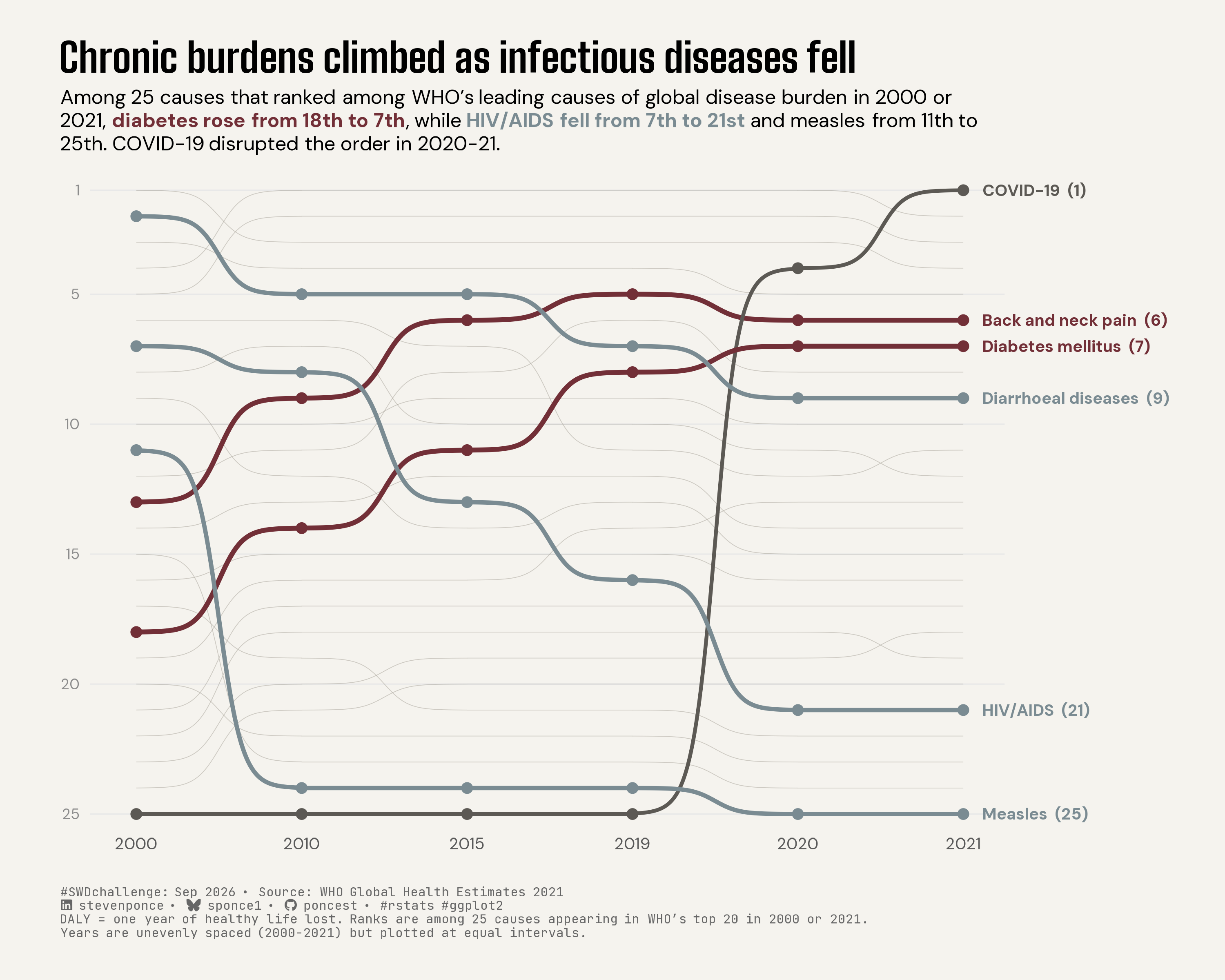
![Bump chart ranking 25 leading causes of global disease burden (DALYs), WHO data 2000–2021. Diabetes mellitus climbed from 18th to 7th and back and neck pain from 13th to 6th, while HIV/AIDS fell from 7th to 21st and measles from 11th to 25th — a two-decade shift from infectious to chronic burden. COVID-19 disrupted the pattern abruptly, jumping from 25th in 2019 to 1st by 2021. Diarrhoeal diseases held steady near 9th. Twenty other tracked causes appear as unlabeled gray reference lines. Source: WHO Global Health Estimates 2021.](swd_2026_09.png){#fig-1}

### [**Steps to Create this Graphic**]{.mark}

#### [1. Load Packages & Setup]{.smallcaps}

```{r}
#| label: load

if (!require("pacman")) install.packages("pacman")
pacman::p_load(
  tidyverse, ggtext, showtext, janitor, scales, glue, ggview, ggbump
  )

# Source utility functions
suppressMessages(source(here::here("R/utils/fonts.R")))
source(here::here("R/utils/social_icons.R"))
source(here::here("R/utils/image_utils.R"))
source(here::here("R/themes/base_theme.R"))
```

#### [2. Read in the Data]{.smallcaps}

```{r}
#| label: read

# The workbook was tidied separately in `WHO_GHE_DALY_tidy.R`.
# https://github.com/poncest/SWDchallenge/blob/main/2026/09_Sep/WHO_GHE_DALY_tidy.R

df_tidy <- read_csv(
  here::here("data/SWDchallenge/2026/who_ghe_daly_global_tidy.csv"),
  show_col_types = FALSE
) |>
  clean_names()

```

#### [3. Examine the Data]{.smallcaps}

```{r}
#| label: examine
#| include: true
#| eval: true
#| results: 'hide'
#| warning: false

glimpse(df_tidy)
skimr::skim_without_charts(df_tidy)
```

#### [4. Tidy Data]{.smallcaps}

```{r}
#| label: tidy
#| output: false

endpoint_causes <- c(
  "Lower respiratory infections", "Diarrhoeal diseases",
  "Preterm birth complications", "Ischaemic heart disease", "Stroke",
  "Tuberculosis", "HIV/AIDS", "Birth asphyxia and birth trauma", "Malaria",
  "Road injury", "Measles", "Chronic obstructive pulmonary disease",
  "Back and neck pain", "Congenital anomalies", "Other neonatal conditions",
  "Cirrhosis of the liver", "Self-harm", "Diabetes mellitus",
  "Depressive disorders", "Interpersonal violence", "COVID-19",
  "Trachea, bronchus, lung cancers", "Other hearing loss", "Falls",
  "Kidney diseases"
)

year_lookup <- tibble(year = c(2000, 2010, 2015, 2019, 2020, 2021), year_index = 1:6)
# x-axis uses year_index (equal categorical spacing), not true year value.
# True temporal spacing was tested and reverted: it made
# COVID's rise correctly abrupt but crowded the 2019-2021 endpoint label
# Caption disclose the six periods are unevenly spaced in reality.

highlight_causes <- tribble(
  ~cause,                 ~story_group,
  "Diabetes mellitus",   "Rising chronic burden",
  "Back and neck pain",  "Rising chronic burden",
  "HIV/AIDS",            "Declining infectious burden",
  "Measles",             "Declining infectious burden",
  "Diarrhoeal diseases", "Declining infectious burden",
  "COVID-19",            "Pandemic disruption"
)

df_bump <- df_tidy |>
  filter(cause %in% endpoint_causes) |>
  group_by(year) |>
  mutate(rank = min_rank(desc(dalys))) |>
  ungroup() |>
  left_join(year_lookup, by = "year") |>
  left_join(highlight_causes, by = "cause") |>
  mutate(
    story_group = factor(
      story_group,
      levels = c("Rising chronic burden", "Declining infectious burden", "Pandemic disruption")
    )
  ) |>
  arrange(cause, year)

df_background <- df_bump |> filter(is.na(story_group))
df_highlight  <- df_bump |> filter(!is.na(story_group))
df_labels <- df_highlight |> filter(year == 2021) |> mutate(label = glue("{cause}  ({rank})"))

```

#### [5. Visualization Parameters]{.smallcaps}

```{r}
#| label: params

### |-  plot aesthetics ----
clrs <- get_theme_colors(
  palette = list(
    rising     = "#722F37", 
    declining  = "#7A8B92", 
    disruption = "#5C5954", 
    background = "#C7C2B8",
    accent     = "#722F37", 
    neutral    = "#9B968C"  
  )
)

story_colors <- c(
  "Rising chronic burden" = clrs$palette[["rising"]],
  "Declining infectious burden" = clrs$palette[["declining"]],
  "Pandemic disruption" = clrs$palette[["disruption"]]
)

### |- titles and caption ----
title_text <- "Chronic burdens climbed as infectious diseases fell"

subtitle_text <- glue(
  "Among 25 causes that ranked among WHO's leading causes of global disease burden ",
  "in 2000 or 2021, <span style='color:{story_colors[[\"Rising chronic burden\"]]}'><b>diabetes rose from 18th to 7th</b></span>, ",
  "while <span style='color:{story_colors[[\"Declining infectious burden\"]]}'><b>HIV/AIDS fell from 7th to 21st</b></span> ",
  "and measles from 11th to 25th. COVID-19 disrupted the order in 2020-21."
)

caption_text <- paste0(
  create_swd_caption(
    year = 2026,
    month = "Sep",
    source_text = "WHO Global Health Estimates 2021"
  ),
  "<br>DALY = one year of healthy life lost. Ranks are among 25 causes appearing in WHO's top 20 in 2000 or 2021.",
  "<br>Years are unevenly spaced (2000-2021) but plotted at equal intervals."
)

### |- fonts ----
setup_fonts()
fonts <- get_font_families()

### |- plot theme ----
base_theme <- create_base_theme(clrs)

weekly_theme <- extend_weekly_theme(
  base_theme,
  theme(
    axis.title = element_blank(),
    axis.text.x = element_text(family = fonts$text, size = 9, color = "grey35"),
    axis.text.y = element_text(family = fonts$text, size = 8, color = "grey55"),
    axis.ticks = element_blank(),
    panel.grid.major.x = element_blank(),
    panel.grid.major.y = element_line(color = "grey91", linewidth = 0.35),
    panel.grid.minor = element_blank(),
    legend.position = "none",
    plot.title = element_text(
      family = fonts$title_1, face = "bold", size = 22, margin = margin(b = 8)
      ),
    plot.subtitle = element_textbox_simple(
      family = fonts$subtitle, size = 11, margin = margin(t = 4, b = 20), 
      lineheight = 1.25
    ),
    plot.caption = element_markdown(
      family = fonts$caption, size = 7, color = "grey40", hjust = 0, 
      margin = margin(t = 20, b = 0),  lineheight = 1.15
      ),
    plot.margin = margin(t = 24, r = 130, b = 24, l = 36)
  )
)

theme_set(weekly_theme)
```

#### [6. Plot]{.smallcaps}

```{r}
#| label: plot
#| output: false

### |-  plot ----
p <- ggplot(df_bump, aes(x = year_index, y = rank, group = cause)) +
  geom_bump(
    data = df_background,
    color = clrs$palette[["neutral"]],
    alpha = 0.45,
    linewidth = 0.2,
    smooth = 7
  ) +
  geom_bump(
    data = df_highlight,
    aes(color = story_group, linewidth = story_group),
    smooth = 7
  ) +
  geom_point(
    data = df_highlight,
    aes(color = story_group),
    size = 2.4
  ) +
  geom_text(
    data = df_labels,
    aes(x = 6.12, label = label, color = story_group),
    hjust = 0,
    size = 3.15,
    family = fonts$text,
    fontface = "bold"
  ) +
  scale_color_manual(values = story_colors, guide = "none") +
  scale_linewidth_manual(
    values = c(
      "Rising chronic burden" = 1.35,
      "Declining infectious burden" = 1.2,
      "Pandemic disruption" = 1.05
    ),
    guide = "none"
  ) +
  scale_x_continuous(
    breaks = year_lookup$year_index,
    labels = year_lookup$year,
    limits = c(0.72, 6.25),
    expand = expansion(mult = 0)
  ) +
  scale_y_reverse(
    breaks = c(1, 5, 10, 15, 20, 25),
    limits = c(25.5, 0.5),
    expand = expansion(mult = 0)
  ) +
  coord_cartesian(clip = "off") +
  labs(title = title_text, subtitle = subtitle_text, caption = caption_text)
```

#### [7. Save]{.smallcaps}

```{r}
#| label: save
#| warning: false

### |- save ----
main_path  <- here::here("data_visualizations", "SWD Challenge", "2026", "swd_2026_09.png")
thumb_path <- here::here("data_visualizations", "SWD Challenge", "2026", "thumbnails", "swd_2026_09.png")

# Full-size version, for the QMD figure
save_ggplot(
  plot = p,
  file = main_path,
  width = 10,
  height = 8,
  units = "in",
  dpi = 300,
  create.dir = TRUE
)

# Reduced-size thumbnail, for the YAML `image:` field
fs::dir_create(dirname(thumb_path))
magick::image_read(main_path) |>
  magick::image_resize("400") |>
  magick::image_write(thumb_path)
```


#### [8. Session Info]{.smallcaps}

::: {.callout-tip collapse="true"}
##### Expand for Session Info

```{r, echo = FALSE}
#| eval: true
#| warning: false

sessionInfo()
```
:::

#### [9. GitHub Repository]{.smallcaps}

::: {.callout-tip collapse="true"}
##### Expand for GitHub Repo

The complete code for this analysis is available in [`swd_2026_09.qmd`](https://github.com/poncest/personal-website/tree/master/data_visualizations/SWD%20Challenge/2026/swd_2026_09.qmd). For the full repository, [click here](https://github.com/poncest/personal-website/).
:::

#### [10. References]{.smallcaps}
::: {.callout-tip collapse="true"}
##### Expand for References

**SWD Challenge:**
- Storytelling with Data: [September 2026 — bump it!](https://community.storytellingwithdata.com/challenges/sep-2026-bump-it) 

**Data Sources:**
- World Health Organization. *Global Health Estimates 2021: Disease burden by cause, age, sex, by country and by region, 2000–2021.* December 2020. <https://www.who.int/data/gho/data/themes/mortality-and-global-health-estimates/global-health-estimates-leading-causes-of-dalys> — global DALYs by cause, 2000, 2010, 2015, 2019, 2020, 2021. WHO's `Top20` worksheet reports the 20 leading causes in 2000 and 2021; their union forms the 25-cause comparison set ranked in this chart.

**Data Preparation:**
- Tidying script: [`WHO_GHE_DALY_tidy.R`](https://github.com/poncest/SWDchallenge/blob/main/2026/09_Sep/WHO_GHE_DALY_tidy.R) — converts the WHO workbook into long/tidy format prior to the ranking and visualization steps in the main script.
:::


#### [11. Custom Functions Documentation]{.smallcaps}

::: {.callout-note collapse="true"}
##### 📦 Custom Helper Functions

This analysis uses custom functions from my personal module library for efficiency and consistency across projects.

**Functions Used:**

-   **`fonts.R`**: `setup_fonts()`, `get_font_families()` - Font management with showtext
-   **`social_icons.R`**: `create_social_caption()` - Generates formatted social media captions
-   **`image_utils.R`**: `save_plot()` - Consistent plot saving with naming conventions
-   **`base_theme.R`**: `create_base_theme()`, `extend_weekly_theme()`, `get_theme_colors()` - Custom ggplot2 themes

**Why custom functions?**\
These utilities standardize theming, fonts, and output across all my data visualizations. The core analysis (data tidying and visualization logic) uses only standard tidyverse packages.

**Source Code:**\
View all custom functions → [GitHub: R/utils](https://github.com/poncest/personal-website/tree/master/R)
:::

© 2024 Steven Ponce

Source Issues